A Scion Society of The Baker Street Irregulars

The Inspiration For Our Club Logo
“My own seal.”
– A Scandal in Bohemia (SCAN)

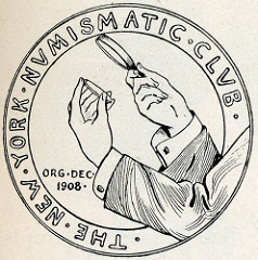
Original Seal of The New York Numismatic Club
With our upcoming second anniversary, this is probably a good time to reveal the inspiration behind the logo for The Fourth Garrideb.
After our founding meeting on August 9, 2014 in Chicago, I started brainstorming ideas for a club seal or logo for TFG. Several ideas for bandied about. A gold sovereign or a silver shilling were possible central designs. Possibly the Syracusan decadrachm that we give to our members? None of these ideas combined our two worlds – coin collecting and Sherlock Holmes, and with a name of The Fourth Garrideb, it was necessary to have a logo that combined those two areas.
While flipping through various sites on the internet, I came across the logo of the New York Numismatic Club. The NYNC has a history that goes back to December 1908. Most of the monthly meetings in the group’s first five years were held at Keen’s Chop House, a restaurant known to many a Sherlockian who has attended the BSI festivities in New York since 1934.
Victor David Brenner designed the NYNC’s first logo, pictured above. Most of you see one of Brenner’s artistic endeavors on a almost daily basis — since 1909 his portrait of Abraham Lincoln has graced our country’s one cent piece or “penny.”
I immediately came up with the idea that our logo would be Sherlock Holmes examining a coin with a magnifying glass. I searched online for a logo maker with the intention of developing a logo for our group myself, but soon found that I don’t have a creative eye. So, instead I asked a local friend, who was a graphic artist. The first attempt is shown below.

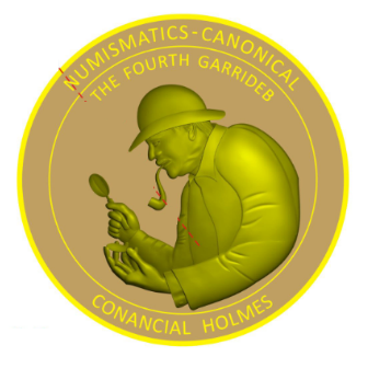
First attempt at the TFG logo – FAIL!!!
I was so disappointed when I saw the design. Holmes is wearing a bowler hat instead of a deerstalker. It appears that Holmes has a mustache. I had suggested some wording, which was garbled on this version. I had asked for the body of Holmes to come out from the edge like the NYNC design. Lastly, every time I looked at the hand holding the coin, I immediately was picturing in my mind the space alien from the movie E.T. We both agreed that a second attempt was not going to happen.
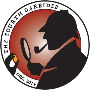
I spent the next several months trying to find another graphic artist that could grasp the concept and work within our budgetary restraints. Last March, while I was working the 2015 National Money Show for the American Numismatic Association in Portland, Oregon, I spent some time with Ben Scott who works for the ANA. Ben had designed the logos for several of the recent ANA conventions, which I rather liked, and I suggested he take a shot at our logo. About 6 weeks later, I had our TFG logos in hand.

The Official TFG logo by Ben Scott
Looking back, I’m glad it took me 7 months to run into Ben – it’s an awesome logo!

Sorry, comments are closed for this post.